Anatomy of a boom (Part 2)
If the boom has not led to a marked increase in inequality, the same cannot be said for government policies. They markedly increased our levels of inequality.
Politics by Numbers: graphically raising issues.
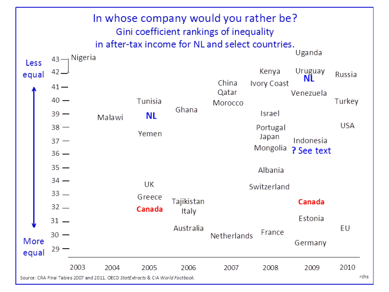
If the boom has not led to a marked increase in inequality, the same cannot be said for government policies. They markedly increased our levels of inequality.
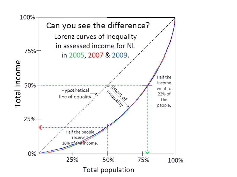
Between 2005 and 2009 assessed incomes in Newfoundland and Labrador increased by 49%. The boom we are experiencing is without precedent in Canadian history, but it is also exceptional for a quite different reason.
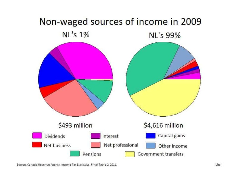
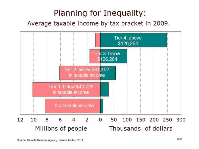
Ownership of stocks, bonds, real estate and professional incomes set the 1% apart from the rest of us.
Finally, we can answer the question: What did they actually do?
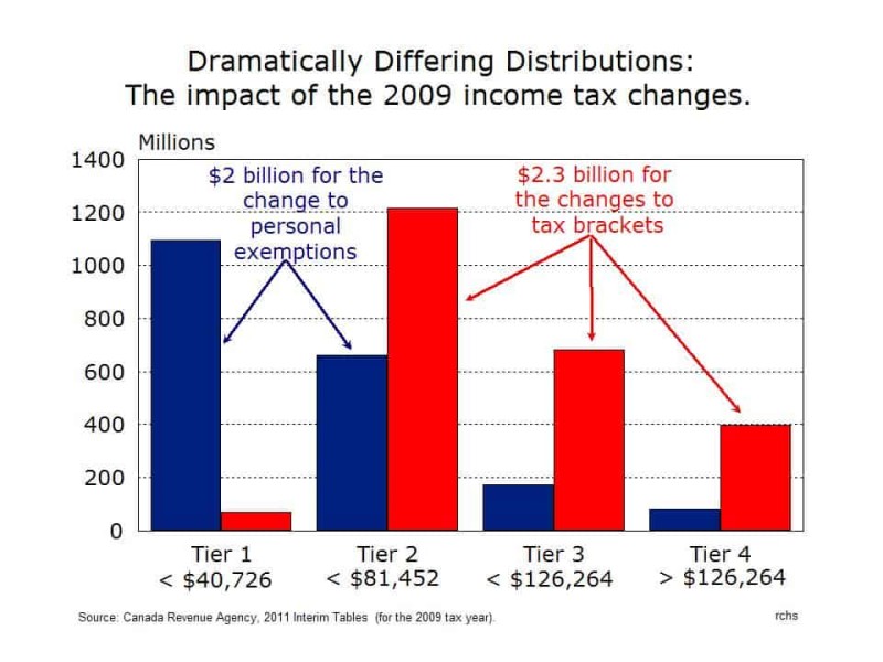
Lower taxes, ah yes, but for whom?
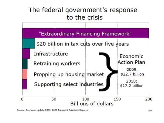
All you need to know about the largest government program that they chose not to tell you about
What does the feel-good ad about taxes tell us?
An inconvenient truth we need to discuss

What is Jason Kenney up to?
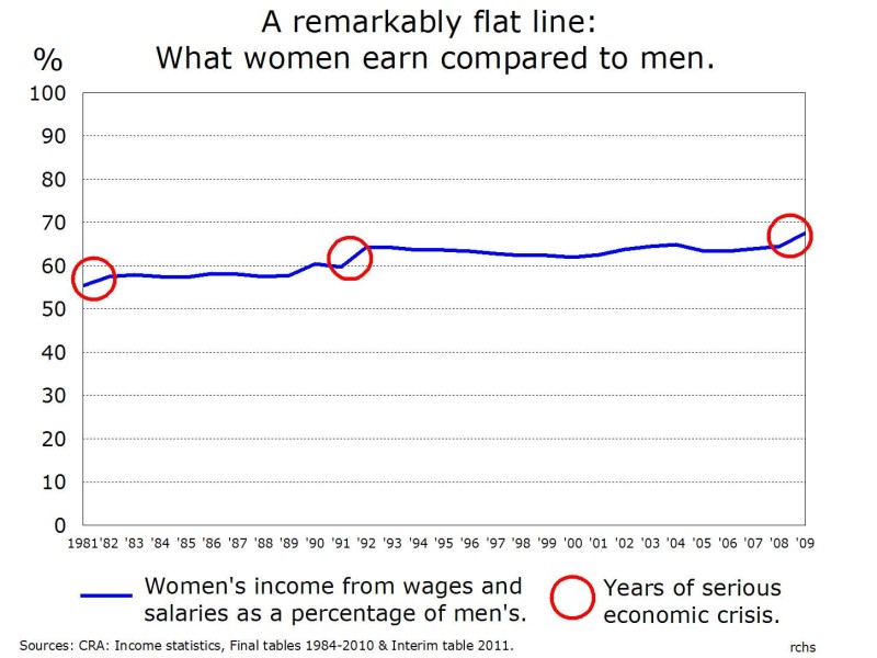
On this 100th anniversary of International Women's Day, Robert Sweeny analyzes how 'we are dealing with deeply rooted and probably largely non-economic forms of resistance to gender equity'